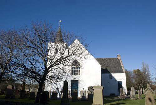
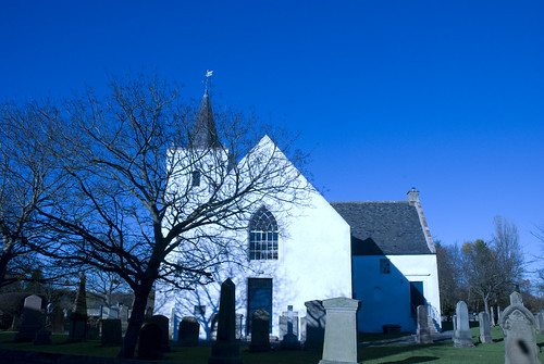
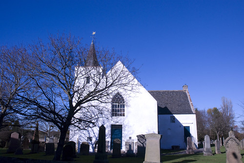
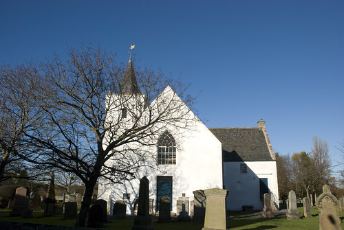
Saturday, 15 January 2011

Exercise 26

What: There is main brief if this exercise was to capture the primary and secondary colours alone either filling or as a single point in each frame. The exercise also required that the image be bracketed by an exposure on either side to show the variations in brightness and saturation that it causes on each colour.
Where: In the house, due mainly to the weather,
When: Various times, sometime with natural light and at other times utilising whatever light source was available.
How: First of all I had to find the right hue of colour I wanted to capture for each part of the exercise.
I found this exercise quite frustrating as repeatedly I would come up with an idea, which I would photography only to find that the saturation and brightness did not differ enough to register, or that the hue was not right, or that the idea just did not work.
At first I expected to go through this exercise fairly quickly, but I quickly found that to obtain the exact hue was quite difficult and that many of my ideas failed to produce a satisfactory image.
In the end I spent a fair amount of a month and a bit just trying to come up with suitable images for this exercise.

What I was fully expecting to see was that the actual saturation of the primary and secondary colour would be affected by the amount of light going through the lens and the aperture of the camera.

As I captured each set of images I uploaded the images from the camera and did a straight conversion of the RAW image into a JPEG without changing any of the settings from the camera.

Primary Colours

Red

I expected this shot to come out fairly quickly as I was surrounded by the colour red, however many ideas that I came up with (curtains, fruit, cars, doors, post-boxes, etc) did not have the exact hue. I finally chose this set of exposures from a flower inside the house.

D80,Aperture f/4, Shutter Speed 1/20 sec, ISO 400, 105mm (35mm equivalent 157mm), Pattern Metering Mode, Auto White Balance, Tripod Mounted, 105mm lens.
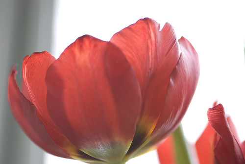
DSC_0095

I feel that this +1 exposure has left the hue of the red looking much washed out and faded. The shadows from the overlapping petals don’t appear to be as well defined as in the other two exposures (the main one and the -1) and the shapes of the petals are not as well defined. The background also appears to very light and again washed out.

D80,Aperture f/4.5 , Shutter Speed 1/20 sec, ISO 400, 105mm (35mm equivalent 157mm), Pattern Metering Mode, Auto White Balance, Tripod Mounted, 105mm lens.
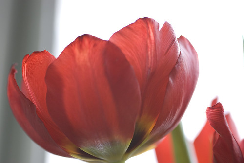
DSC_0096

This normal exposure has the hue that I wanted, the hue appears to be less pink and the shape of the petals are well defined and the surface pattern of the petal can be seen clearly. The hue is not dominated by the shadows from the overlapping petals. The background is just right as it does not draw the eye away from the subject.

D80,Aperture f/5 , Shutter Speed 1/20 sec, ISO 400, 105mm (35mm equivalent 157mm), Pattern Metering Mode, Auto White Balance, Tripod Mounted, 105mm lens.
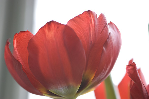
DSC_0097

This -1 exposure almost has the hue that I wanted, the shape of the petals are well defined and the surface pattern of the petal can be seen clearly however I feel that the hue is dominated by the shadows from the overlapping petals distorting the hue away from the red and towards the black, this along with the slightly darker stripe in the background draws the eye away from the subject.

Yellow

I expected this shot to come out fairly quickly as I immediately had an idea and the subject that I wanted. The bright yellow hue of the boots is very eye-catching and I think it is the perfect subject. I was tempted to shoot the image on a black background to examine what affect this would have on the yellow of the boots, but unfortunately the room I use of shoot these images was flooded after the roof developed a leak and I have not had the opportunity to obtain the black background and use it.

D80,Aperture f/8 + EV, Shutter Speed 1/8 sec, ISO 400, 55mm (35mm equivalent 82mm), Centre Weight Metering Mode, Auto White Balance, Hand Held, 55-200mm lens.
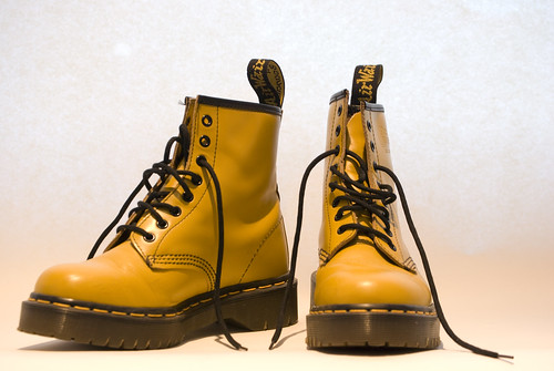
DSC_0139

I went with the Centre weight metering mode as the lights in the room were overpowering and making the composition too bright and too yellow due to the colour temperature of the ceiling lights.

I feel that this +1 exposure has left a very bright hue of yellow and has spots of white which look burnt out with no definition on the white glare spots, especially on the upper areas of the boots where they catch the light from the ceiling lamps. I almost prefer this to the normal exposure as the yellow is quite bright and “happy” and it gives the greatest contrast between the bright yellow and the blacks.

D80,Aperture f/8 , Shutter Speed 1/8 sec, ISO 400, 55mm (35mm equivalent 82mm), Centre Weight Metering Mode, Auto White Balance, Hand Held, 55-200mm lens.
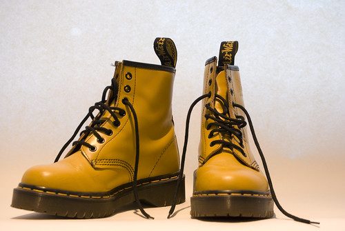
DSC_0138

This normal exposure has the hue that I wanted for the exercise, the hue appears to be less white and the spots of light are less burnt out and are better defined. The surface and shapes of the boots are better defined in this image as the shadows are easier to se, it helps to define the shapes within the subject especially around the ankle area of the boot on the left of the frame. The background however has taken on a red hue from somewhere and draws the eye away from the image. I also feel that it affects the hue of the boots at the toes and heels as they appear to have less of brightness and it appears to me to be affected by the red from the background, although they are not reflecting the light from the background.

D80,Aperture f/8 - EV, Shutter Speed 1/8 sec, ISO 400, 55mm (35mm equivalent 82mm), Centre Weight Metering Mode, Auto White Balance, Hand Held, 55-200mm lens.
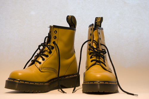
DSC_0137

This -1 exposure does not have the hue that I was looking for, the hue is heading towards red and it is too dark and the shapes and shadows on the boots dominate the composition drawing the eye into the darkness and away from the yellow. It also shows up the dark marks on the boots that the other two exposures do not.

Blue
Again I expected this shot to come out fairly quickly as I was surrounded by blues, again I experimented with different ideas, sky, glass, paint, cars, fabric, but I could not find the hue that I was looking for. Again and again I would shoot the subject only to find that the differentiation is brightness was minimal or that the hue was not right. As my frustration increased I found that I was left only looking for two hues, blue being one of them. I spent a fair bit of time photographing different hues of blue until I finally found one that I liked. I wanted to closely control the light so I manually set the camera and adjusted the settings for each exposure.

D80,Aperture f7.1, Shutter Speed 1/6 sec, ISO 1600, 105mm (35mm equivalent 157mm), Centre Weighted Metering Mode, Auto White Balance, Tripod Mounted, 105mm lens.
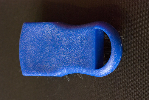
DSC_0010

I feel that this +1 exposure leaves the main part of the subject with a slightly brighter hue of blue. But the bottom left hand side of the frame has a yellow tinge from the light above the subject. The contrast in the brightness of the hue is not too great and offers almost a uniform hue of hue due to the brightness of the exposure.

D80,Aperture f8, Shutter Speed 1/6 sec, ISO 1600, 105mm (35mm equivalent 157mm), Centre Weighted Metering Mode, Auto White Balance, Tripod Mounted, 105mm lens.
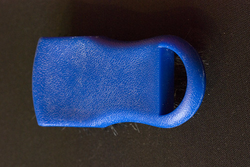
DSC_0011

This normal exposure has the hue that I wanted; the hue appears to be well defined and there is a slight variance in the hue due to the brightness of the exposure, and this is to be expected as the subject as a slight curve to it. This in turn helps to show the shape of the subject (a cleaning brush) making it well defined and the surface pattern can be seen clearly.

D80,Aperture f9, Shutter Speed 1/6 sec, ISO 1600, 105mm (35mm equivalent 157mm), Centre Weighted Metering Mode, Auto White Balance, Tripod Mounted, 105mm lens.

DSC_0010

This -1 exposure has a darkened hue caused by the reduced brightness. In the top of the frame the less bright exposure means that the top of the subject has lost a little definition and is lost to the shadow.

Secondary Colours

Green

Again I expected this shot to come out fairly quickly as I was surrounded by the colour green of almost the exact hue however like my ideas for red they did not have the exact hue. This was not helped by the snow which covered everything.

I finally chose this set of exposures from a leaf of a plant inside the house.

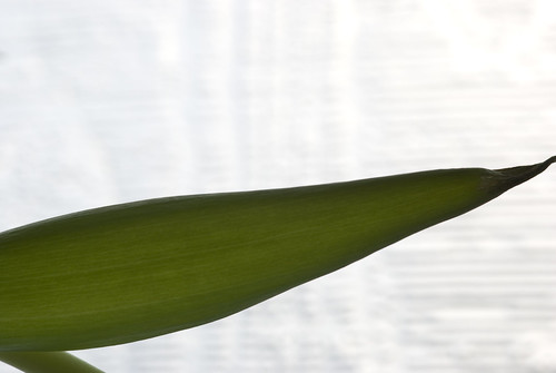
D80,Aperture f/9, Shutter Speed 1/40 sec, ISO 400, 105mm (35mm equivalent 157mm), Pattern Metering Mode, Auto White Balance, Tripod Mounted, 105mm lens.
DSC_0107

I feel that this +1 exposure has left the hue of the green looking very transparent which combined with the light behind it give it more of a yellow hue than of green. However the dried end of the leaf has very good definition and is almost the best definition for that part of the leaf than the other exposures.

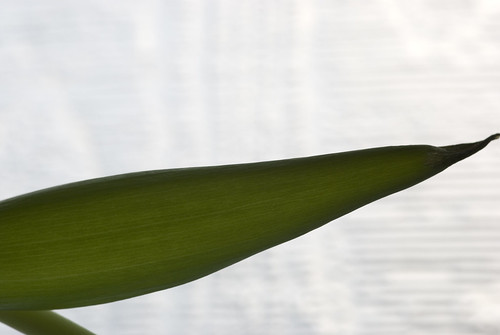
D80,Aperture f/9 , Shutter Speed 1/50 sec, ISO 400, 105mm (35mm equivalent 157mm), Pattern Metering Mode, Auto White Balance, Tripod Mounted, 105mm lens.
DSC_0105

This normal exposure has the hue that I wanted; the hue appears to be less yellow and has a good deep hue to the green. The shape of the leaf is well defined and the surface pattern of the leaf can be seen clearly. The repetitive detail from the window behind can be seen in the background but it does not draw the eye away from the subject.

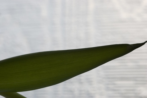
D80,Aperture f/9, Shutter Speed 1/60 sec, ISO 400, 105mm (35mm equivalent 157mm), Pattern Metering Mode, Auto White Balance, Tripod Mounted, 105mm lens.
DSC_0106

This -1 exposure has a hue which is too deep a green for what I wanted for the exercise. The shape of the leaf although well defined is too dark, the end of the leaf looked dark and dry and the surface pattern of the petal was lost at the edges of the leaf. I also feel that the final image is dominated by the repetitive shapes in the background which drew the eye away from the subject and onto the background.


Orange

I played around with various ideas, including logos, lights, flowers, fruit, spools of network cable and paints; None of the ideas worked out to my satisfaction and in the end I returned to a piece of fruit

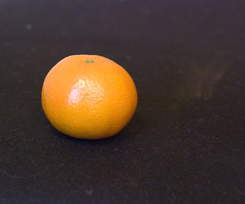
D80,Aperture f/8, Shutter Speed 1/2 sec, ISO 1250, 105mm (35mm equivalent 157mm), Pattern Metering Mode, Auto White Balance, Tripod Mounted, 105mm lens.
DSC_0005_01

I feel that this +1 exposure is too bright and the hue has lost a lot of its properties as it is too washed out, it feels as if the shape of the subject has been lost and it has become almost two dimensional.

D80,Aperture f/9 , Shutter Speed 1/2 sec, ISO 1250, 105mm (35mm equivalent 157mm), Pattern Metering Mode, Auto White Balance, Tripod Mounted, 105mm lens.
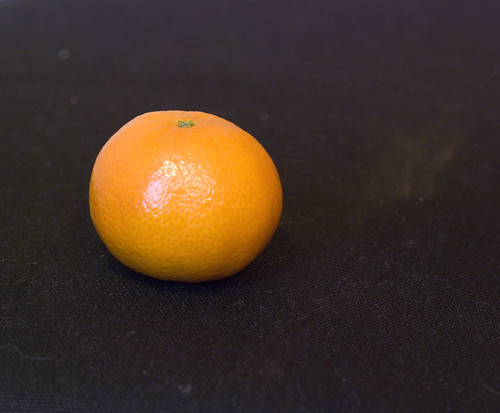
DSC_0004_01

This normal exposure has the proper orange hue and is not too dark. I was worried that the normal exposure would not have the right hue and colours would not be bright enough due to the lack of overall light. The colours are not too uniform and the variations in brightness allows the subject to look curved and three dimensional

I especially like the dark loop of colour at the bottom of the subject where it is reflecting some of the black and it helps to make the subject pop out.

D80,Aperture f/10, Shutter Speed 1/2 sec, ISO 1250, 105mm (35mm equivalent 157mm), Pattern Metering Mode, Auto White Balance, Tripod Mounted, 105mm lens.
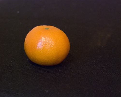
DSC_0006_01

In this -1 exposure the hue is almost uniform and the lack of brightness once again flattens the subject too much, and the subject is lost to the darkness and shadows. The overall brightness I feel is too dark allowing the hue to overtake the subject and lessen the overall composition of the image.

Violet

This was quite a difficult hue to capture again as I was limited to finding a hue which was not too light or too purple. I finally found it on a piece of material which I then photographed under natural light.

D80,Aperture f6.3, Shutter Speed 1/2 sec, ISO 1600, 105mm (35mm equivalent 157mm), Pattern Metering Mode, Auto White Balance, Tripod Mounted, 105mm lens.
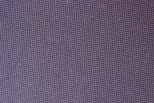
DSC_0013


This is quite a bright hue of violet, the +1 exposure making the hue almost pink or red in tinge, I was surprised to find that it was not too blue as I expected it to be bluer than it came out. The definition of the material is easy to see and I was again surprised to find that the contrast was as quite good.

D80,Aperture f/7.1, Shutter Speed 1/2 sec, ISO 1600, 105mm (35mm equivalent 157mm), Pattern Metering Mode, Auto White Balance, Tripod Mounted, 105mm lens.
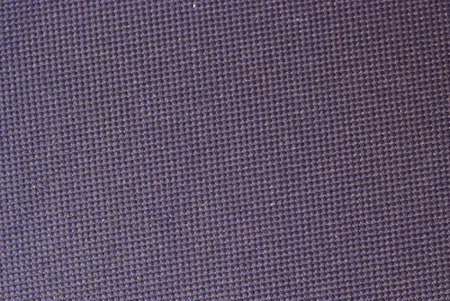
DSC_0012

In this normal exposure I can see that the violet is less bright and the darkness appears not to be in the hue itself more in the weave of the material itself. Although in direct comparison I can see that the hue has been affected by the exposure brightness.

D80,Aperture f/8, Shutter Speed 1/2 sec, ISO 1600, 105mm (35mm equivalent 157mm), Pattern Metering Mode, Auto White Balance, Tripod Mounted, 105mm lens.

DSC_0014

This -1 exposure shows that the reduced light into the lens has caused the hue to be affected by the brightness; it has gained contrast and definition of the material but at the loss of the overall hue and colour of the subject. The weave appears darker and more defined by the shadows of the weave.

In this exercise I have found that once again the brightness can be controlled by exposure and aperture settings and that the hue of a colour can be helped or hindered by this control.

On a personal note I have however found this quite a difficult exercise and it has taken me the best part of two months to complete this single exercise, I have found at times that I began to doubt myself as I found due to my limitations that I could not always control the exposure and obtain the brightness of hue that I wanted.

Wednesday, 17 November 2010

Tutor led visit to “Another World” Surrealist exhibition at the Dean gallery.

I managed to get a place on an OCA Tutor led visit round the “Another World” exhibition at the Dean Gallery; this exhibition covers the rise of Dadism and Surrealism, not only in Art but as a complete movement. I learned of the rise of Dada as a style and movement at the start of the First World War; this rise was in reaction to the styles of government and society, the collective artists involved rejected the prevailing standards in art and through their “anti-art” stance they transformed ordinary objects juxtaposing their everyday use with the artist’s expression.
Both Dadaist and Surrealist art use symbolism, insect imagery, dream imagery, automatic writing, painting, drawing and photomontage. I was surprised to see that some artists used book illustrations from a previous age and used them as derivative art pieces to create new montages.

Some of the artists experimented with Automatic painting by placing objects over photosensitive paper and then placing them in the sun, as done by many very early photographers including “Robert Adamson” In a lot of these images, the extreme contrast between black and white made for stark images with intense shape definition. Other used Solarisation, the exposure of an image to sunlight during the developing process, to produce abstract images with less well defined shapes, whose edges draw the viewer’s eye in to the image in an attempt to construct the dark edges into everyday shapes.

I was surprised to see that one of the first exhibits we were led to was by Man Ray; up until that moment I was unaware of Man Rays work outside of the sphere of photography, we were shown “Man Ray 1914” the visual style of it reminded me of the use of light, shade and shape used by German Film directors and artists during “German Film expressionism”

As the tutor led us through these images, she mentioned Lee Miller who I had only heard of in passing at an exhibition on Vogue magazine photography and a single photograph by David E. Scherman of her sitting in Hitler’s bath in “The Great Life Photographers” I was very surprised to discover that not only was Miller a photographer herself, but of her involvement with a number of the artists in the surrealist movement not only on a professional level, but on a personal level. We were then given the opportunity for the group to split up and go off and examine, draw or study any of the pieces within the exhibition. I decided that I would like to wander around and see which of the exhibits drew my eye and made me think about them.

Among the works which were discussed I was attracted to a number of them on a personal level. I was drawn to “The Forest” by Max Ernst as it reminded me of slow shutter experimentation where the camera has been pointed at the lower trunks of some trees and then shutter has been fired and the camera moved up quickly before the shutter is closed, the same movement within the frame is caused by the lighter upward shooting lines from the dark bottom of the frame to the light top of the frame . It was not until I was looking at the painting for a few minutes that I spotted a green circle near the middle top of the frame which represents the sun.

In one room hang 10 pieces of art which are meant to be shown together, all these pieces by Man Ray simply use just primary, secondary colours along with black to form abstract layer shapes where two primary colours combined would produce a secondary colour. However where a secondary colour overlays a primary colour a different primary colour is produced e.g. orange overlay/interacts with red produced blue in one piece, this was not repeated in other pieces where the same interaction would produce a different primary colour or black. This interaction of colours is random and quite eye-catching. In some of the pieces there were wire frame shapes, some random, some organic and some geometric. This experimentation with wireframe geometric shapes also appears in the painting “aviary” where a geometric shape dominates the composition while not dominating the frame.

Alberto Giacometti - Head/Skull

I spent quite a long time studying the carving “Head/Skull” by Alberto Giacometti; by moving position around this sculpture I am presented with two interlocking fates. On one side a cubist face, the mouth open as if gasping for breath the eyes open staring forward into the middle distance. On the other side I am presented with a wide angular cheekbone of a skull, again the eye socket staring off into the middle distance, the angular jaw bone joining the mouth at the chin. On this side however I can see that the skull is locked inside the head and that one cannot exist without the other.

Leonora Carrington - Head

I was surprised to find that this painting by Leonora Carrington simply called “Head”
was not listed in the catalogue, this staring nightmarish face leers out of a haze of gray mist and swirls. Only the nose, the lower eye lids and the upper lip are defined. The eyes, irises white with small dark pupils stare out of the frame locking the gaze of the viewer, filled with anger and hate, the rest of the face and head dissipate starting with the cheekbones into the gray colourless mist. The imagery of the face leaning out of the mist was very attention-grabbing, it reminded me of a description of “DR Hyde” and even now the eyes from the image are stuck in my visual memory.

Salvador Dali - Exploding Raphaelesque Head

Dali’s Exploding Raphaelesque Head demonstrates Dali’s angst at the unleashing of the atomic age with the destruction of Hiroshima; The swirling disintegration and atomisation of the Raphaelesque head shows the artists fear that all creation, civilisation and art would be destroyed in an instant due to the immense power of the atomic bomb. I believe that I can see the formation of a mushroom cloud taking shape through the open cupola of the Pantheon; the force of the atomic disintegration ripping apart civilisation and art. The image can also be seen as a demonstration of Dali’s interest in the discovery of the atom and the scientific discovery that all things, pain, canvas and complete image are just vibrations of atomic particles. He plays with the idea that the image is flying apart as everything is basically made up of vibrating dots and wide spaces between the atoms.

Max Ernst - Sea & Sun

This painting split into two sections, one calm blue and white and the other reds, oranges and black mixed together with a black circle offset to one side. Could the lower portion of this painting be a sunspot on the surface of the sun? By 1925 when this painting was completed sunspots had been discovered and observed. The painting has a texture, within the frame caused by the movement of a comb over the surface of the painting; this comb has gathered some of the red and black paint from this lower portion and it has been transferred to the upper portion of the painting bringing a random chaotic rent to the calm surface. This rent also uncovers the red from a over painted section where a red diamond with a black dot peeks out from the reflected surface like a submerged object suddenly rising to the surface of a calm pond breaking the mirror like reflection.

Rene Magritte – Black Flag

In this image of dark blues, greys and blacks, nightmarish planes fly through the dark sky in a random chaotic formation. As soon as I viewed this image I was caught by the tension that these nightmarish creations should not be able to fly and that their rush to be airborne they are about to crash into each other, the implied movement in the image is that they are about to come together in front of the viewer. This I feel helps to create a sense of panic within the image, which is what the artist was trying to create as he was emotionally distressed by the night time bombing of a Spanish village by the German Air force in 1937.

At the point of time of painting the term black flag had already become a term of anarchy, as it represented a state of no country or no government a feeling that the Dadaist and the Surrealists would have supported as part of their own manifesto.

I enjoyed this Tutor led tour as it helped me to understand a lot more about the methods, principles and philosophies of the Dadaists and the Surrealists. I now understand better what they were trying to achieve when they created their works of art and I have found several pieces of art that I have a deeper understanding of.

Wednesday, 10 November 2010

Exercise 25

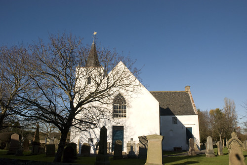
What: There is no real brief for this exercise as I decided to emulate the examples in the exercise on Hue and shoot a location but vary the white balance within the camera
Where: Gifford Church on the main corner of the village of Gifford, East Lothian
When: Between 11:00 and 11:30 on a bright, but cold winters morning.
How: First of all I had find a good position that I could set up on and where the light was not too bright on the outer wall of the church. The wall is south facing and the sun is low on the horizon.

I was expecting to see that the actual hue of the whole image would be affected by the white balance of the camera.
I decided that I would go beyond just the first couple of white balance settings and I went right through the full set available on the camera. When I returned home I uploaded the images from the camera and did a straight conversion of the RAW image into a JPEG without changing any of the settings from the camera.

AWB - Auto White Balance

I expected this shot to come out with a white balance which was well balanced. I expected to see white whites and blue blues.

D80,Aperture f/18, Shutter Speed 1/200 sec, ISO 320, 18mm (35mm equivalent 27mm), Pattern Metering Mode, Auto White Balance, Tripod Mounted, 18-70 lens.

Gifford Church AWB

The Auto White Balance of the can have a mild affect on the image as the white was slightly golden with the low yellow sunlight. However the camera worked out the correct hue to apply to the image to stop it being too red or too blue.

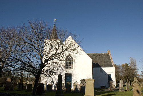
Tungsten White Balance

D80,Aperture f/18, Shutter Speed 1/200 sec, ISO 320, 18mm (35mm equivalent 27mm), Pattern Metering Mode, Tungsten White Balance, Tripod Mounted, 18-70 lens.

From the notes I was expecting a very blue tinted image, and in this image the hue has been affected by the white balance setting.

Gifford Church Tungsten White Balance

I was surprised to see how the hue of the grass was affected and how the blue made the colour darker and slightly more saturated. I can see from the white of the church how far the hue has been affected and how the blue of the door appears to be more saturated.


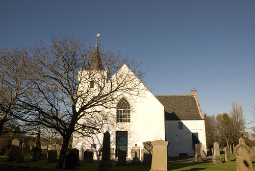
Fluorescent White Balance

D80,Aperture f/18, Shutter Speed 1/200 sec, ISO 320, 18mm (35mm equivalent 27mm), Pattern Metering Mode, Fluorescent White Balance, Tripod Mounted, 18-70 lens.

Gifford Church Cool White Fluorescent white balance

I was expecting from this shot an image which had a red hue to it. I was surprised to see that this white balance did not make the final image redder. I was expecting the white to be affected in the same way as the Tungsten White Balance and it to have a deeper red hue to the image. On deeper inspection I would see a red tingle to the white of the church.

Flicking between these first three images I was very surprised to see;
that the AWB had a slightly green hue to it
that the Tungsten White Balance had a blue hue to it and
that the Fluorescent White Balance had a red hue to it.

This is effect was the camera using one of the three primary planes of colour within the sensor (RBG) when influencing the image from the point of the selected white balance.

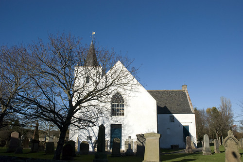
Fine Weather White Balance

D80,Aperture f/18, Shutter Speed 1/200 sec, ISO 320, 18mm (35mm equivalent 27mm), Pattern Metering Mode, Fine White Balance, Tripod Mounted, 18-70 lens.

Gifford Church Fine Weather White Balance

This white balance is almost the same hue and affect in white balance as the Auto White Balance.

Flash White Balance

D80,Aperture f/18, Shutter Speed 1/200 sec, ISO 320, 18mm (35mm equivalent 27mm), Pattern Metering Mode, Flash White Balance, Tripod Mounted, 18-70 lens.

Gifford Church Flash White Balance

As the flash did not fire this white balance is purely based on the sunlight coming into the lens. Again this has a slight red hue to it, but not as much as the Fluorescent White Balance.


Cloudy Weather White Balance

D80,Aperture f/18, Shutter Speed 1/200 sec, ISO 320, 18mm (35mm equivalent 27mm), Pattern Metering Mode, Cloudy White Balance, Tripod Mounted, 18-70 lens.

Gifford Church Cloudy Weather White Balance

I found it had to see a difference in hue to the Flash White Balance, if anything the hue was slightly red.

Shade White Balance

D80,Aperture f/18, Shutter Speed 1/200 sec, ISO 320, 18mm (35mm equivalent 27mm), Pattern Metering Mode, Shade White Balance, Tripod Mounted, 18-70 lens.

Gifford Church Shade White Balance

This white balance is affected by a slightly yellow hue to the image; this is caused by the Shade White Balance. I can clearly see in the branches of the trees that there is a yellow/red hue to the final image.


5000k White Balance

D80,Aperture f/18, Shutter Speed 1/200 sec, ISO 320, 18mm (35mm equivalent 27mm), Pattern Metering Mode, 5000k White Balance, Tripod Mounted, 18-70 lens.


Gifford Church 5000K White Balance

I was surprised to see that this White Balance had a slight blue hue to it. Having never used this White Balance setting before I was unsure what the final effect would be. The final image is again similar to the Auto White Balance

PRE (set) White Balance

D80,Aperture f/18, Shutter Speed 1/200 sec, ISO 320, 18mm (35mm equivalent 27mm), Pattern Metering Mode, PRE White Balance, Tripod Mounted, 18-70 lens.

Gifford Church PRE White Balance

Having used a bridge camera before and used the PRE setting for white balance I knew that this would have little effect on the final image. It is mainly used in conjunction with a white or grey card to set the White Balance which is out with the preset White Balance available. It is used instead of the Auto White Balance to better control the colours and hues for the final images.

Looking at the thumbnails of the images after uploading them, I could see subtle differences in the hues between some of the White Balance Settings. Some were easier to spot while others were quite subtle.

All in all I was surprised to how far the hue of an image could be pushed by the settings on the camera, again this has shown that the colours can be controlled through and by the camera.

Wednesday, 3 November 2010

Exercise 24

What: The brief of this exercise was to examine the how I could control the strength of a colour
Where: Various Locations
When: On afternoon in dull overcast weather, the light was very grey and sullen.
How: First of all I had to read the text a couple of times to fully understand the that I had to use the camera to take a “normal average” exposure and then take 2 photographs where the subject was underexposed and two photographs where the subject was overexposed. Each under and over exposure had to be done by a half of one stop and then one full stop. I first of all made sure that my camera was in aperture exposure so at the start of the exercise I could double check the aperture and speed settings before moving the camera into manual mode. I then took the shot and then changed the aperture setting on the camera up and down to get the under and over exposure settings.

I had a good think about the brief of this exercise as I have been reading Johan Wolfgang von Goethe – The Theory of Colours and Johannes Ittens – The elements of Colour as I had wanted to refresh myself on colour theory, something which I have not really approached since my school days in Art class.

I was expecting to see that the brightness of the colours in the images varied with the exposure setting but not the saturation.

I also decided that I would go beyond just photographing a single image with differing aperture settings that the exercise specified as I wanted to see if different colours behaved differently, so I chose four different subjects to see if I could easily spot the differences at processing and writing up time. From reading the above books I knew that depending on the background of the image that the colour would vary.


I decided to first of all shoot a primary colour and see what happened.

Red Jersey

One stop underexposed.

D80,Aperture f/10, Shutter Speed 1/400 sec, ISO 320, 300mm (35mm equivalent 450mm), Pattern Metering Mode, Auto White Balance, Manual Mode, Tripod Mounted, 70-300mm VR lens.

red-f10

Half a Stop Underexposed

D80,Aperture f/9, Shutter Speed 1/400 sec, ISO 320, 300mm (35mm equivalent 450mm), Pattern Metering Mode, Auto White Balance, Manual, Tripod Mounted, 70-300mm VR lens.

red-f9

Average Exposure

D80,Aperture f/8, Shutter Speed 1/400 sec, ISO 320, 300mm (35mm equivalent 450mm), Pattern Metering Mode, Auto White Balance, Manual, Tripod Mounted, 70-300mm VR lens.

red-f8

Half a Stop Overexposed

D80,Aperture f/7.1, Shutter Speed 1/400 sec, ISO 320, 300mm (35mm equivalent 450mm), Pattern Metering Mode, Auto White Balance, Manual, Tripod Mounted, 70-300mm VR lens.

red-7point1

One Stop Overexposed

D80,Aperture f/6.3, Shutter Speed 1/400 sec, ISO 320, 300mm (35mm equivalent 450mm), Pattern Metering Mode, Auto White Balance, Manual, Tripod Mounted, 70-300mm VR lens.

red-f6point3

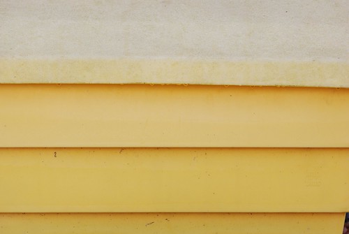
I then decided to shoot another primary colour which had a different hue and saturation level to it as I wanted to see if primary colours behaved in the same way when over and under exposed. I decided on the yellow grit bin as it was one of the brightest things in the surroundings

Yellow Grit Bin

One stop underexposed.

D80,Aperture f/10, Shutter Speed 1/200 sec, ISO 320, 140mm (35mm equivalent 210mm), Pattern Metering Mode, Auto White Balance, Manual Mode, Tripod Mounted, 70-300mm VR lens.

yellow-f10

Half a Stop Underexposed

D80,Aperture f/9, Shutter Speed 1/200 sec, ISO 320, 140mm (35mm equivalent 210mm), Pattern Metering Mode, Auto White Balance, Manual, Tripod Mounted, 70-300mm VR lens.


yellow-f9

Average Exposure

D80,Aperture f/8, Shutter Speed 1/200 sec, ISO 320, 140mm (35mm equivalent 210mm), Pattern Metering Mode, Auto White Balance, Manual, Tripod Mounted, 70-300mm VR lens.

yellow-f8

Half a Stop Overexposed

D80,Aperture f/7.1, Shutter Speed 1/200 sec, ISO 320, 140mm (35mm equivalent 210mm), Pattern Metering Mode, Auto White Balance, Manual, Tripod Mounted, 70-300mm VR lens.

yellow-f7point1

One Stop Overexposed

D80,Aperture f/6.3, Shutter Speed 1/200 sec, ISO 320, 140mm (35mm equivalent 210mm), Pattern Metering Mode, Auto White Balance, Manual, Tripod Mounted, 70-300mm VR lens.

yelllow-f6point3

I could see from the thumbnails of the images that the red example was slightly better defined in the range of colour due to the exposures, I could see that the colour became brighter but lost none of its saturation. The yellow example was a little harder to spot the differences.

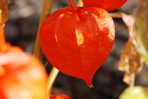
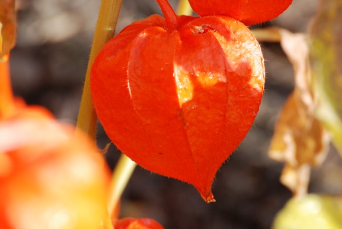
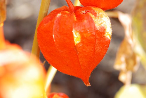
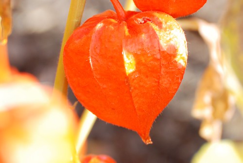
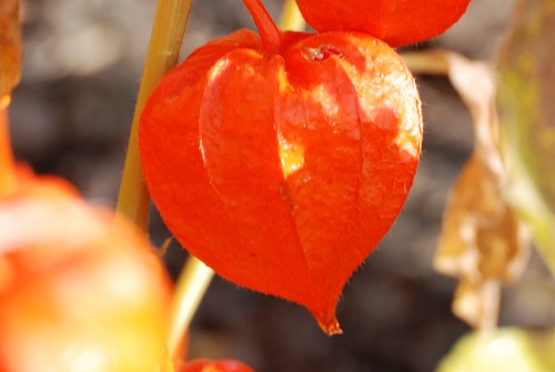
I then decided to photograph an orange Physalis as I wanted to see what secondary colours would do under the same conditions. I was drawn to the Physalis as I knew that light penetrated the subject and it thought it may differ in brightness and saturation due to it being almost back light. I expected that the light coming through the subject due to its transparency would destroy most of the detail of the subject when overexposed.

Orange Physalis
One stop underexposed.

D80, Aperture f/18, Shutter, Speed 1/60 sec, ISO 320, 300mm (35mm equivalent 450mm), Pattern Metering Mode, Auto White Balance, Manual Mode, Tripod Mounted, 70-300mm VR lens.

orange-f18

Half a Stop Underexposed

D80, Aperture f/16, Shutter, Speed 1/60 sec, ISO 320, 300mm (35mm equivalent 450mm), Pattern Metering Mode, Auto White Balance, Manual, Tripod Mounted, 70-300mm VR lens.

orange-f16


Average Exposure

D80, Aperture f/14, Speed 1/60 sec, ISO 320, 300mm (35mm equivalent 450mm), Pattern Metering Mode, Auto White Balance, Manual, Tripod Mounted, 70-300mm VR lens.

orange-f14

Half a Stop Overexposed

D80, Aperture f/13, Speed 1/60 sec , ISO 320, 300mm (35mm equivalent 450mm), Pattern Metering Mode, Auto White Balance, Manual, Tripod Mounted, 70-300mm VR lens.

orange-f13

One Stop Overexposed

D80, Aperture f/11, Speed 1/60 sec, ISO 320, 300mm (35mm equivalent 450mm), Pattern Metering Mode, Auto White Balance, Manual, Tripod Mounted, 70-300mm VR lens.


orange-f11

I was surprised to see that the back lighting of the subject did not make it become too washed out and loose all its detail when overexposed. I thought that it may have become lost in a bloom of orange white and I was very suprised to see that it retained details as well as some of its colour

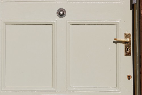
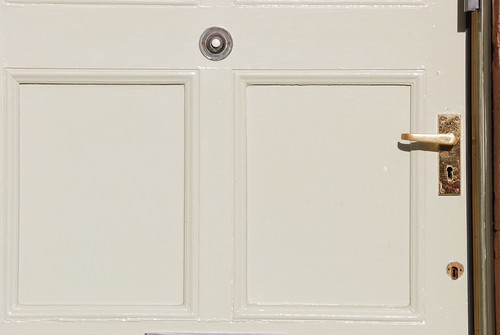
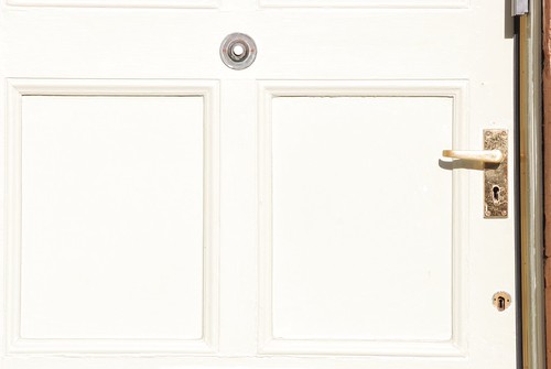
Finally I wanted to see what would happen to white when under and over exposed, I wanted to see if the white would become grey when under exposed and when overexposed the subject would quickly lose all detail within one stop and become very bright and blown out.


One stop underexposed.

D80, Aperture f/29, Shutter, Speed 1/200 sec, ISO 320, 220mm (35mm equivalent 330mm), Pattern Metering Mode, Auto White Balance, Manual Mode, Tripod Mounted, 70-300mm VR lens.

white-f29

Half a Stop Underexposed

D80, Aperture f/25, Shutter, Speed 1/200 sec, ISO 320, 220mm (35mm equivalent 330mm), Pattern Metering Mode, Auto White Balance, Manual, Tripod Mounted, 70-300mm VR lens.

white-f25

Average Exposure

D80, Aperture f/22, Speed 1/200 sec, ISO 320, 220mm (35mm equivalent 330mm), Pattern Metering Mode, Auto White Balance, Manual, Tripod Mounted, 70-300mm VR lens.

white-f22

Half a Stop Overexposed

D80, Aperture f/18, Speed 1/200 sec, ISO 320, 220mm (35mm equivalent 330mm), Pattern Metering Mode, Auto White Balance, Manual, Tripod Mounted, 70-300mm VR lens.

white-f18

One Stop Overexposed

D80, Aperture f/16, Speed 1/200 sec, ISO 320, 220mm (35mm equivalent 330mm), Pattern Metering Mode, Auto White Balance, Manual, Tripod Mounted, 70-300mm VR lens.

white-f16

Again just looking across the thumbnails of the images I could quickly how much of a difference it made in the appearance of the colour just by choosing an exposure. I was suprised to see how much of a difference in the colour of a white door could be made to differ just through exposure.

As I was writing up this exercise I referred back to the notes paying attention to the examples for saturation and brightness as I did not want to confuse the two concepts as I had already made that mistake when I first looked at the range of colour from each selection of images that I had taken.

This was quite an interesting exercise; as it verified some of the points in the books I am reading, it also showed that the colour of a subject could be varied and influenced by under or overexposing the image. This means that the colour of a subject can be controlled to a certain extent by the camera and the photographer.

Thursday, 30 September 2010

Assignment 2 – The Elements of Design

What: The brief of this assignment was to incorporate the insights learned so far on the course and produce a set of at least 10 images directed towards one type of subject.

Where: In the house using various tabletops and counters as shooting locations.

When: The photographs were taken over multiple days using differing locations and light sources.

How: First of all I had to read the text a couple of times to fully understand the brief of the Assignment. As I progressed through the assignment I made notes in my daybook in the style of a diary. I also included in the daybook some drawings and diagrams on some of the concepts that came to mind after reading the text. I will include these notes and concepts in this assignment paper.

I looked through the choice of subjects available and decided on elements of food as the subject that I would use for my brief, food is something which is close to my heart as I enjoy cooking as it helps relax me at the end of a day.

One of the first ideas I thought about was the triangle and pyramid shapes made by a bunch of bananas; I thought about a white background and then stacking up the bananas so that the dark ends of the bananas formed a triangle, this along with a long depth of field showing the bananas bending off into the distance.

I started to think about citrus fruit and the shapes that can be made from them by cutting up the fruit in different directions to the segments of the fruit. Stacking apples into a triangle shape also quickly came to mind but I decided to reject the idea on the basis that it may be a little clichéd.

While working in the kitchen I could examine each ingredient as I used it with the brief in mind.

Looking down at the ends of a handful of dried spaghetti, I hit on the idea of using a macro end on shot of the spaghetti ends which would produce the concept for Pattern.

I also considered black or coloured peppercorns, lines in flour or rice, stacking tins to produce a triangle or a cup very closely at a wide angle. I also considered a knife edge for lines. Some of these Ideas I tried out and some I never carried forward from the initial idea, not because they were poor ideas and concepts rather that I went in a different direction with another idea.

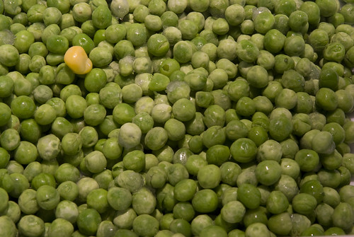
The first Image Single point dominating the composition; One of the first ideas I had for this composition was that I wanted a single egg yolk on a plain black background. I was considering using a black square plate for the background of the composition but found that it was too glossy and that the plate had a deep curve which stood out when any light hit the plate.

In the final composition I wanted the background to be very much a pattern going in all directions and that the single point should be on one of the intersections of one of the lines in the rule of thirds. With this in mind I used a single yellow corn on a background of green peas. I carefully placed the corn on the peas and then looking through the camera viewfinder I adjusted the position of the corn until I was happy with the final composition. The main source of light was two halogen lights above the composition.

I slightly cropped the image in Photoshop to remove some of the extraneous background which was unnecessary.

01. Single point dominating the composition; Nikon D80, focal length 70.0mm (35mm equivalent 105mm), aperture f29.0, speed 1 second, ISO 200, -1 step on the exposure, auto white balance, matrix metering, tripod mounted camera, No flash.


01.Simple Point dominating the composition

I am quite happy with the final composition as it does quite clearly show that the corn is the single point dominating the rest of the composition; it does draw the eye to point.

The second image Two points; At first I went with two eggs in eggcups positioned away from each other diagonally across the frame, however the composition when viewed and thought about did not really work out as the eggs were too close a colour to the wooden board which was acting as the background. The other problem was that the eggcups themselves were dominating the composition due to their colour. As this was not within the brief I quickly dropped that idea. After thinking about the composition for an hour or two, I changed my mind and quickly rehashed my idea of an egg yolk being a point within a composition, however this time I would include either another yolk, possibly cooked or, as in the final composition, a piece of egg shell. After breaking a couple of eggs I chose a piece of shell and gave it a rinse in cold water to remove the gloss from the shell and to basically clean the shell of any remaining egg white. I then placed the piece of shell in a position and photographed a couple of different shots where the shell was either in a different position or in a different orientation. In the end I liked the position and orientation of the shell, but it would not sit in position, and I had to use a small piece of corn behind the shell to support it and allow the orientation and position that I wanted. I then spent some time gently cleaning the yolk to remove bubbles of egg white which were in the way.

Again I cropped the final shot slightly as there was a small space at the corner of the glass sheet in the far right corner which was drawing the eye away. This crop also allowed me to tighter up the composition and makes it appear as if the shell and yolk were closer together. The light source for this photograph was from two halogen bulbs in a cooker hood above the board and surface.

02. Two Points; Nikon D80, focal length 62.0mm (35mm equivalent 93mm), aperture f29.0, speed 1.5 second, ISO 200, auto white balance, matrix metering, tripod mounted camera, No flash.


02.Two Points

I’m much happier with this final composition as the two points relate in balance making for a very strong composition and there is a narrative and relationship between the yolk and the shell. I wanted a long depth of field for this photo to allow all the parts of the two points to be seen and be clear.

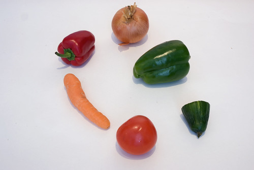
The third image Several Points in a deliberate shape; I went back to the workbook notes and looked over them as I wanted this composition to be clear in my mind. After thinking about using grapes, dried fruit I decided on using some vegetables. I laid out a white paper background on a table and experimented with different layouts making different shapes. I really wanted a clear shape, so I went with an elliptical circle as this draws the eye around it. I had chosen a wide range of items and I knew that I just had to look at the setup and keep swapping items in and out of the composition until I had the shape that I wanted.
As I sat looking at the composition I noted that there was too much light coming in the window and this was casting long shadows on the subjects. I closed the curtains. While this pushed the exposure speed down to 2 seconds it did not fully reduce the shadows and I then switched off all the surrounding lights, this pushed the exposure speed down to 10 seconds but it also stopped the long shadows being cast which pulled the eye away from the composition.

03. Several Points in a deliberate shape; Nikon D80, focal length 29.0mm (35mm equivalent 43mm), aperture f25.0, speed 10 seconds, ISO 200, auto white balance, matrix metering, tripod mounted camera, No flash.


03.Serveral points in a deliberate shape

While this is a very simple composition, the shape is deliberately simple, I am not fully happy with this image as I found that it was a little clichéd. However it fitted the brief and I am particularly pleased that I managed to use a bend carrot as this moves the eye through the composition. It almost looks like a guiding pointing arrow.

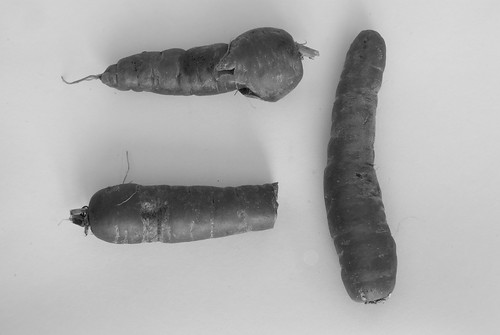
The fourth image A combination of Vertical and Horizontal lines; when I started to think about this composition I started to think about a grid of intersecting lines and I had the notion about using spaghetti, corn on the cob, spring onions, leeks, ends of bread or toast soldiers. My first basic idea for the composition was to make a grid of spring onions and looking straight down shoot the image from directly above the subject.

It was while I was working on another composition that I noticed that I had a few left over carrots, I then decided to use them as the subject for the image. I noted that the surface of the carrots themselves had horizontal lines running across them I then experimented with a few layouts of the carrots shooting each composition and combination and then looking at the image on the back of the camera. I decided on the final layout and with a little tinkering with the carrots themselves I shot two exposures of the image, one with the curtains open letting in some sunlight in combination with overhead light and the second exposure I closed the curtains and switched off the lights, this made for a very long exposure of 15 seconds which was a great difference to the first which was shot at 1/200th of a second. When I looked at the images on the screen I liked the longer exposure as it had a bit more character to the image and the carrots were not overbalanced by their shadows. Once I viewed the image on my PC screen I changed the image from colour to monochrome and I could see that the carrots had further definition on them and that they themselves had horizontal lines when view vertically and vice versa, this was what lead me to use this as the fourth image.

04. A combination of Horizontal and Vertical lines; Nikon D80, focal length 52.0mm (35mm equivalent 78mm), aperture f29.0, speed 15 seconds, ISO 200, auto white balance, matrix metering, tripod mounted camera, No flash. Converted into B&W in Photoshop


04.A combination of Horizontal and Vertical Lines


I am pleased with this final composition as the carrots are presented using the rule of thirds and the unusual shape of the carrots is further defined by the use of black and white rather than colour.

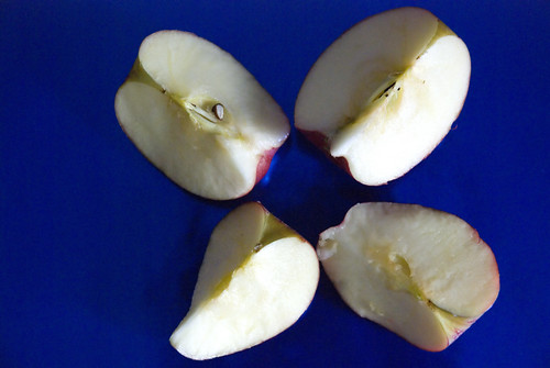
The fifth image Diagonals; at first I could not think of a definitive image that I could produce for Diagonals and for a few days it was one of the shots that eluded me. At first I was going to use a large watermelon and photograph the end of it, where all the lines come together, however I could not find a watermelon which was not either battle scarred or had a dark circle at the end of it. Again I went back to the idea of citrus fruits and I considered the diagonal lines created when a fruit is sliced in half and the segments all meet together in the middle, in a kind of faux perspective. I was not too happy with this idea in the end and I finally went with the split apple. I found that if I split the apple and arranged it that I could have diagonal lines at the centre of each section of apple, the diagonal lines as each segment lined up with its opposite part, a square and a circle all within the same composition. I used the blue background to allow the apples to stand out. The background paper was very shiny so I could not use a flash otherwise the middle section of the composition was just a mass of blown out white.

05. Diagonals; Nikon D80, focal length 70.0mm (35mm equivalent 105mm), aperture f7.1, speed 1/50th second, ISO 3200, auto white balance, matrix metering, tripod mounted camera, No flash.


05.Diagonals

To achieve the overhead shot, I had to dismantle the tripod and use the central section as a boom arm; this made taking the shot difficult as any movement caused the camera to bounce. I got round this by using an IR remote to trigger a countdown on the camera before it fired the shutter, this allowed me to position and adjust the camera, check the framing and then allow the camera to stop moving before I took the shot , I was not sure at first about the definition of the apples, but I was not too concerned as it was more important that the definition of diagonal lines were present. I think that I lucked out with the final composition as the apples still look nice and I have the lines and shapes in the final composition.

The sixth image Curves; I had a bit of fun with, as I just ran mad with ideas for differing compositions for the image. I considered amongst other things, a stack of dried apricots, onion slices, cob lettuce, Chinese leaf lettuce (both sliced across the way) and a pile of apple skin. I also considered biscuits but decided that they may be out of the scope of the brief!

I set my mind on using the apricot skins, until I saw the film Hard Boiled. During one scene an actor was talking and while he did this he peeled an apple. The coils of skin just drew my eye and I decided on the use apple skin which had been removed in one long spiral; I planned to hang it up on a piece of cotton thread and photographed it against a pale background. In the long term I was not happy with the way that the apple skin hung, so I went with orange skin but in a coiled pile on a tabletop. I placed the orange skin on a white background to help define the skin and used a very straight on perspective to the orange skin. This produced quite a weak composition so I moved the camera up a bit and recomposed from a slightly higher angle. This helped to define the curves in the skin and I was much happier with the image.
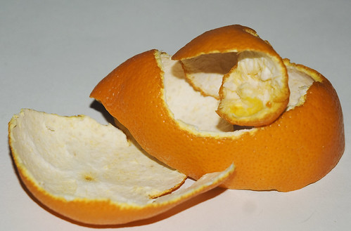
06. Curves; Nikon D80, focal length 70.0mm (35mm equivalent 105mm), aperture f4.5, speed 1/200th second, ISO 200, flash white balance, matrix metering, tripod mounted camera, Flash was fired but auto controlled by the camera


06.Curves

The final composition easily demonstrated the curves created in the orange skin and the white background did not wash out the orange pith. I’m not 100 percent happy with the background as the top left hand corner was a little darker than the rest of the image. I considered lightening it using Photoshop but I thought that this would be artificial enhancement of the image and cheating, so I left it as is.

The seventh image Distinct if Irregular shape; for this I threw a large handful of dried fruit and nut mix down onto a tabletop. I did this a couple of times until I achieved a truly random shape and not a clump of fruit. This produced quite a number of irregular shapes, but it was not until I was checking the images off the printer that I began to feel that this was not what was wanted and that it was a particularly weak image.

I sat back from it and looked at it pinned on the wall and I was not happy with the image. I then decided that I would have to reshoot it another day.

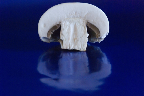
I thought of a mushroom as it was an irregular shape but it was also distinct, I then sliced a mushroom in half and had a good look at it, I noted that the shape itself was spoiled by the top skin of the mushroom and I then peeled the skin from it. This helped to further define the shape I then placed it onto the blue shiny paper background as this was an excellent contrast to the colour of the mushroom and set up the camera and tripod for a macro shot.

As I composed the macro shot I pulled the camera and tripod back a little so that I could get both the mushroom and it’s irregular reflection within the frame.

07. Distinct if Irregular Shape; Nikon D80, focal length 105mm (35mm equivalent 157mm) using a Macro Lens, aperture f13, speed 1/4th second, ISO 3200, auto white balance, matrix metering, tripod mounted camera, No flash.


07.Distinct if Irregular shapes

After viewing the image on screen I decided to remote a little of the gain of the high ISO by using Neat Image as this did not change the colour, shape or definition of the final image, it just removed some of the grain caused by the Nikon cameras high ISO.

I am very pleased with this as the final image as both the colour and the reflection work for the composition. The shape of the mushroom is clear and well defined against the blue background and it almost looks like it is reflected in water.

The eight, ninth tenth and eleventh images Implied Triangles; I had a number of ideas that I experimented with for this brief. I had to produce at least two types of implied triangle for the brief and I chose to do one which would be a triangle produced by perspective and the other would be an implied triangle through positioning of items.

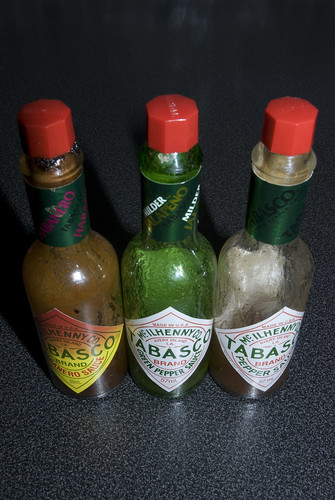
The first of these is the implied triangle by perspective. I started by placing three bottles together in two lines with the first in front of the other two, but this made up a real triangle when viewed from a high point of view using a wide angled lens. I then swapped to just two bottles and recomposed again with a high point of view for position, this made for a very centre heavy compostion, so I added the third bottle back in again but this time inline with the other two and I then recomposed on a tighter view of the bottles and using a wide angle lens this produced an implied triangle in shape.

08. Implied Triangle; Nikon D80, focal length 31mm (35mm equivalent 46mm), aperture f25, speed 1/60th second, ISO 3200, auto white balance, matrix metering, tripod mounted camera, No flash.


08.Implied triangle01

It was after I had printed a proof of the image that I noted that the implied triangle was not too clearly defined and that it may not be the strongest image to portray an implied triangle. I have not discarded it all together but submitted it along with a third implied triangle image.

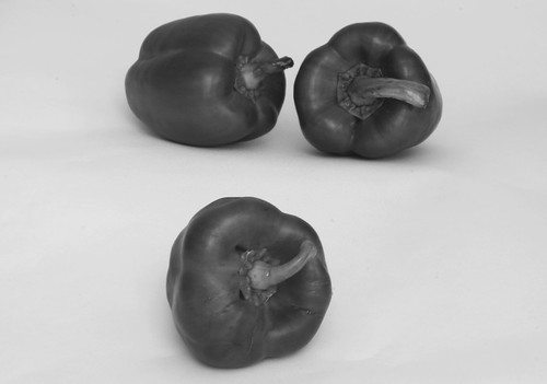
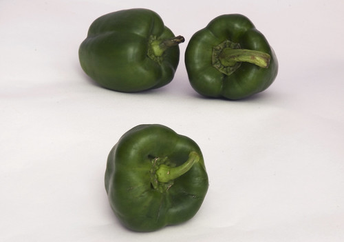
Implied triangle number two; using the course notes for inspiration I setup this shot , I used some items behind the background to create a two step layer so that the back level was higher. I then laid out the two peppers on the higher step and the third on the lower step. I changed the orientation of the peppers until I was happy with the composition and photographed it.

09. Implied Triangle; Nikon D80, focal length 65mm (35mm equivalent 97mm), aperture f29, speed 28 seconds, ISO 200, auto white balance, matrix metering, tripod mounted camera, No flash. Converted into B&W in Photoshop


09.Implied triangle02

10. Implied Triangle; Nikon D80, focal length 65mm (35mm equivalent 97mm), aperture f29, speed 28 seconds, ISO 200, auto white balance, matrix metering, tripod mounted camera, No flash.


10.Implied triangle02-colour

Once the image was on the computer I post processed the image to see how it would look in monochrome, I could not choose which version was the better version so I decided that I would submit them both but as one shot rather than two separate items.

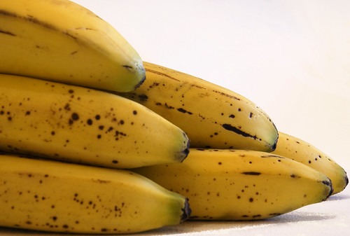
Implied triangle number three; After proofing the image with the bottles, I decided that it may not portray the concept of an implied triangle, so I setup this third implied triangle shot. Like a few of my other shots for this brief I have gone back to an original idea and adapted it for another concept. In this case I liked the idea and colour of the bananas and I thought that they would work well as an implied triangle. As previously stated I was looking at ends of the bananas but I kept thinking that they produce a real triangle rather than an implied triangle. I then moved the board around examine the framing and composition until I hit on this shot.

11. Implied Triangle; Nikon D80, focal length 70mm (35mm equivalent 105mm), aperture f11, speed 0.8 seconds, ISO 400, auto white balance, matrix metering, tripod mounted camera, No flash.


11.Implied Triangle

I liked that fact that the bananas sweep into the frame from the left and end in the implied triangle due to the different lengths of banana. The shape formed is not quite so much of a real triangle, more of an implied triangle. There is also a little rhythm in the green and back ends of the bananas. I like the colour and the shape that the stack of bananas makes and the movement through the frame.

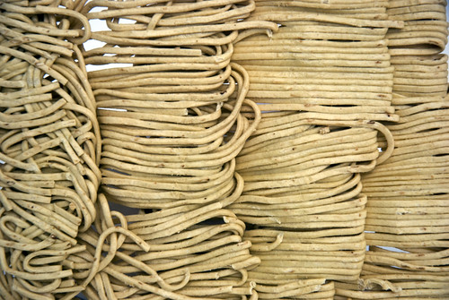
In the twelfth image Rhythm; again I went back to the course notes and looked at various different foods that i had in the kitchen. I liked the idea of using dried noodles because just like the dried spaghetti, they look different when dried as to when they are cooked. I liked the way that the noodles were stranded together and that the noodles repeated both across and down the tray of noodles. I balanced them on the long end of the noodles and photographed them trying to get as close as I could to the entire tray without either leaving too much outside the frame.

12. Rhythm; Nikon D80, focal length 70mm (35mm equivalent 105mm) aperture f13, speed 1/3rd second, ISO 200, auto white balance, matrix metering, tripod mounted camera, No flash.


12.Rhythm


I liked this image as it has a relationship between the tension and the looseness of the dried noodles. I also like it as my eye flows around the image following the repetitive shape and flow.

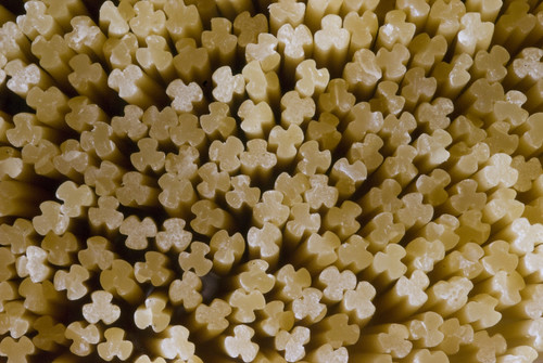
In the thirteenth image Pattern; I had quickly hit on this idea after looking at some spaghetti, after looking down at the ends of a handful of dried spaghetti, I liked the idea of a macro shot end on shot of the spaghetti ends as this would show the strange shape of the spaghetti strands. This was quite a simple setup and image to photograph. I just held enough dried spaghetti together with an elastic band and using a macro lens on the camera just moved the tripod closer to the ends so that the spaghetti was the only this visible in all directions. Also by using the macro lens I got a bit of perspective looking along the length of the spaghetti strands.

13. Pattern; Nikon D80, focal length 105mm (35mm equivalent 157mm) using a Macro Lens, aperture f57, speed 10 seconds, ISO 800, auto white balance, matrix metering, tripod mounted camera, No flash.


13.Pattern

I am really happy with this image as it just came together really easily. I liked the original concept and it was quite an easy photograph to take as it just all sat together nicely.


I have found this assignment a bit of a challenge as it forced me to concentrate on one subject. This allowed me to experiment with different angles and composition techniques to obtain an image that I was happy with. There are some things I have learned quite quickly and I used them throughout the assignment.

Don't Panic - keep looking and thinking. If an idea does not work, ask yourself if the idea or composition can be reworked to make it better suit another part of the brief.

Don't be satisfied with the first shot. I have started to examine the composition before and after taking the image, as there may be a better way to present the subject or there may be a small item which pulls the eye away

Prepare and adapt - keep working the idea, work slowly, confidently and (again) do not be satisfied until the image is captured in the camera.

Tripods and other equipment are just tools, not a sign of weakness in composition.

Document and log everything because you might just need that idea again.

Thursday, 16 September 2010

Update - Working on Assignment 2

Just an update on where I am at the moment; I am now working on the images for Assignment 2. I have reviewed the course notes to further clarify the brief and allow me to think through some ideas.

Already I have thrown away a few ideas as they have not worked out in reality, epsecially when small items that I had not considered throw the whole composition off.

Things I have learned so far

  • Don't Panic - keep looking and thinking. If an idea does not work, can the idea or composition be reworked to make it better suit another part of the brief.
  • Don't be satisfied with the first shot - I have started to examine the compositon before and after taking the image, as there may be a better way to present the subject or there may be a small item which pulls the eye away.
  • Prepare and adapt - keep working the idea, work slowly, confidently and (again) do not be satisfied until the image is captured in the camera.
  • Tripods and other equipment are just tools, not a sign of weakness in composition.

This has been good fun, so far and I am enjoying the challenge of creating the images and working through ideas.

Sunday, 12 September 2010

Exercise 23

What: The brief of this exercise was to examine the world around us and produce a pair of images which demonstrate the principals of rhythm and pattern.
Where: Various Locations near a local coal fired power station
When: On afternoon in dull overcast weather.
How: First of all I had to read the text a couple of times to fully understand the difference in the principles between rhythm and pattern.

As I can understand it rhythm is where the image contains a form of movement within the image and pattern is where the image is more static and does not contain much movement.

I had a good think about the brief of this exercise and thought about differing styles including macro photography both in the house and outside. However I decided on photographing outside and went to a location that I knew near by, which was a local coal fired power station. I knew that I would find a location within this area which would be suitable for at least one of the two requirements of the brief.

Rhythm

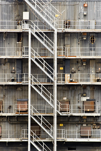
I was looking for a strong image for this exercise; I looked for something which was both unusual and eye-catching. At first I wanted to use the repetitive design of the stations glass front, however once I was set up and looking at the building that I found that the composition did not work. I then walked around the entire station to see if I could find a better composition. It was during this walk down that I spotted the stairway going down the side of building. It had lots of repeating features and was while looking through the viewfinder that I found that I was happy with the composition.

It was not until I was back at the PC that I realised that there were a couple of men working on the floors almost at same distance apart from the stair railings. I also liked the repetition of the lights, the doors, the windows and the actual shape produced by the corrugated material making up the building.
I think this is quite strong for rhythm as the rhythm goes in both directions, both across the image as well as down the image. The men working on the floor help to establish the scale of the area.

I did crop the image down slightly to better establish the framing and composition of the image as there was a small imperfection at the top and bottom which took the eye away from the rhythm of the image.

D80,Aperture f/16, Shutter Speed 1/80 sec, ISO 640, 270mm (35mm equivalent 405mm), Pattern Metering Mode, Auto White Balance, Aperture Priority, Hand Held, VR lens.

repetition - slight crop

Pattern.

I was thinking about using rain drops on a window for this image but it did not rain at a convenient time for me to establish a good quality shot. I also spotted a pattern in birds flying above fields being harvested, but in this case I was on a motorway and could not stop, plus I did not have my camera!!

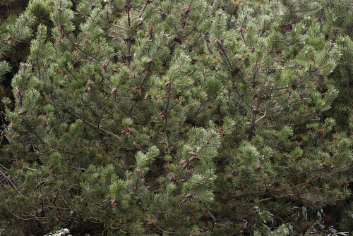
In the end I decided to produce two images which convey pattern. I’m not sure about the first image as I am not sure that it the boundaries are good enough to convey pattern as they have a small hole which drags the eye off to the bottom left.

D80,Aperture f/4.5, Shutter Speed 1/640 sec, ISO 640, 92mm (35mm equivalent 138mm), Pattern Metering Mode, Auto White Balance, Aperture Priority, Hand Held, VR lens.

pattern

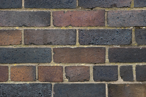
When I started to think about this exercise I was set against photographing a brick wall, I thought that it would be a bit of a cop out. However when I saw this wall I decided to sit down and have a look at it before I disregarded it. I was looking through the viewfinder and I experimented with this brick pattern; I used different distance and framing before deciding on this tight close up of the bricks. I like the fact that there is a small differing pattern running through this image on the small end of the bricks. I also like the different colours of the bricks.
This is actually a brick bench and windbreak built on the hill beside the power station probably at the time the station was built unfortunately it has seen better days.

D80,Aperture f/7.1, Shutter Speed 1/400 sec, ISO 640, 185mm (35mm equivalent 277mm), Pattern Metering Mode, Auto White Balance, Aperture Priority, Hand Held, VR lens.

pattern - bricks

This part of the course has been very interesting as I started to see these elements of design all over the place. It has also helped me examine other photographers and artists work and has allowed me to see the same principals in their work. In some cases it has allowed me to understand better what I like about the image. Again this exercise has reinforced the principles of composition and design.


Now I have to produce the images for Assignment 2.