Where: At various locations
When: Multiple days with varying lighting conditions.
How: First of all I had to read the text a couple of times to fully understand the brief of the Assignment. As I progressed through the assignment I made notes in my daybook in the style of a diary and included in the daybook some drawings and diagrams on some of the concepts that came to mind after reading the text. I will include these notes and concepts in this assignment paper.
I looked at the four kinds of colour relationship detailed in the assignment;
Complementary Colour – colours which face each other across the colour wheel
Similar Colour – colour which are near each other in the colour wheel
Contrasting colours - colours Spaced one Third of the way round the colour wheel
Colour Accent - a spot of accent or colour
At the start due to my mobility issues I decided that I would limit my choices to have no more than 2 controlled shots for each colour relationship. This meant that I would have to take my time and obtain at least 2 uncontrolled shots as well.
I then sat down and considered what kind of shots that I could take and whether they would be controlled or uncontrolled. I detailed what the colour relationship was and what the subject was, noting that I had to remember the ratios for colour within some of the compositions;
These ideas ranged from;
Similar Colours – Warm – A slice of blood orange – an indoor controlled shot
Colour Accent – lifebelt or harness against a painted wooden or stone background – outdoor uncontrolled
Colour Accent – Umbrellas in a crowd (one differently coloured from the rest) – outdoor uncontrolled.
Complementary Colour – red and green pain tubes spilling paint – indoor controlled
Complementary Colour – Violet and yellow using a scabbard and pommel of an antique sword – indoor controlled
Complementary Colour – using homemade gels on flashes to create artificial colours and light within a composition – indoor controlled.
I then started to shoot ideas as they came to me. I was driving home one day and noted the sunset. Although the colours were not quite right I hit on the idea of shooting either a sunset or a sunrise for complementary colour. I attempted quite a few of this composition but did not get the light or the composition correct and in the end I had to abandon the idea but, reused the composition for another image instead.
This happened on an large number of controlled and uncontrolled compositions and in the end I had to abandon the idea of limiting myself as it was hampering my completion the assignment.
Colour Harmony through complementary colours
1.Violet and yellow.
The first Image I proposed to use for this example was a colour 620nm infrared image of a graveyard. The Sky was a dark violet and the trees and grass were a pale yellow, but in the end I did not think this was a within the allowable parameters of the assignment so I did not submit it. I decided to use a piece of violet material and a yellow stitch ripper.
Nikon D80, focal length 55.0mm (35mm equivalent 82mm), aperture f5.6, speed 1/80 , ISO 3200, auto white balance, matrix metering, tripod mounted camera, No flash.
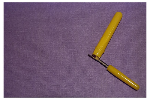
The idea of the composition was to create tension in the composition by drawing the eye into the image by placing the stitch ripper at right angles to itself and to the grain of the material therefore making the eye move through the composition.
2. Green and Red
I wanted to use an idea I had at the start of the assignment, so I made two gels to cover some flashes, one green and the other red. I wanted to position the red one inside a room and the green one on the outside of the room and then shoot the colour relationship created when both flashes fired. I had a try at several compositions and placement of the flashes before I found that the idea just did not work and that the lights and gels did not perform as I expected. I just do not yet have the control and experience of their use. I most cases the green appeared to be very blue or the composition did not work.
Nikon D80, focal length 18mm (35mm equivalent 27mm), aperture f13.0, speed 1/160 second, ISO 400, -1 step on the exposure, auto white balance, matrix metering, tripod mounted camera, 2 off camera flashes.
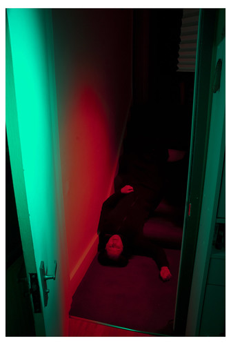
I finally hit on the idea of placing the flashes at different locations within the composition and recomposed the camera on the model laying on the floor as if she had fallen down the steps. I lit her with the red flash and placed the green flash to the right and slightly in front of the camera. Using these locations I obtained the 50/50 split in the light with the right colour and I had captured at least a form of the idea in my head.
3. Green and Pink
It was a few weeks later that I hit on the idea of using tints of red and green. I looked for a hue of green which was a lighter tint of green which was not too dark as I wanted to balance it against the pink. The idea was to show that the pale hue of red, in this case, the pink could be balanced in colour harmony by a pale green.
Nikon D80, focal length 32.0mm (35mm equivalent 48mm), aperture f20.0, speed 1/160 second, ISO 400, auto white balance, matrix metering, tripod mounted camera, On camera flash.
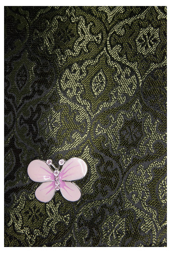
I am happy with this image as the pink does not look like an accent nor a spot and the small pink shape is balanced against the larger green hue of the material due to the diamond pattern breaking up the expanse of the green.
4. Red Violet, Yellow Green, Green and Yellow
While out walking I spotted this pot plant. I liked the splashes of colour and when I looked at it I could spot the colour relationship within the flower shape. I composed the camera close on the flowerpot and shot the image
Nikon D80, focal length 70.0mm (35mm equivalent 105mm), aperture f4.5, speed 1/500 second, ISO 3200, auto white balance, matrix metering, hand-held camera, No flash.
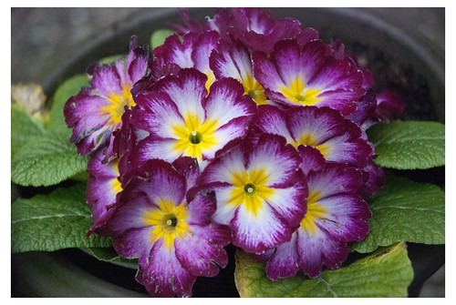
I was happy with this image as not only did I have the straight colour harmony of the red-violet and the yellow-green, but I also had the split complementary of the colour either side of the yellow –green as well. I included this as I was happy to demonstrate the colour harmony of both the complementary and the split complementary as well.
Similar Colours
1.Blues - cool
While attempting to capture the complementary colours of a sunrise I had noted that the sunrise would produce a warm orange against the dark blue of a sky. Unfortunately I was unable to capture the image as I had wanted to I just could not obtain the correct hue of blue or orange. What I did notice to my surprise was that the blues and violets produced around a sunrise were very cold.
I waited for a clear morning where the sun was just above the horizon so that the final image was not too dark and it was not overridden by the yellow of the sun. I then captured a single shot of the colours produced by the foreground and the background to the sunrise.
Nikon D80, focal length 110.0mm (35mm equivalent 165mm), aperture f32, speed 1/60 second, ISO 640, auto white balance, matrix metering, hand-held camera, No flash
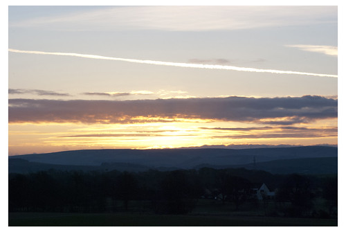
I am very happy with this image as although it has a band of bright warm yellow in the middle of the composition, the cool range of blues of the foreground, background and sky within the composition makes for a cold cool image.
2.Orange and Red - warm
This was one of the first ideas that I had for similar colours as I had just bought a bag or oranges and found that all the oranges in the bag were blood oranges. I wanted to simply place a cut blood orange onto a white background and then using a soft box for light. I believed that I could place the orange slice at an angle which would show both the warm orange skin, the small curve of yellow beneath the skin and the warm deep red of the orange flesh.
Nikon D80, focal length 105.0mm (35mm equivalent 157mm), aperture f22, speed 1/160 second, ISO 400, auto white balance, matrix metering, hand-held camera, No flash but light from above with strong light from a desk lamp
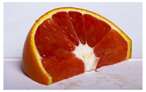
It took me a couple of attempts to get the right shape of slice and to position it correctly within the composition to get the right combination of colours and the right shape I was looking for. In the end I was very happy that the original idea had worked out and that the colours were exactly how I wanted them.
3.Blue and Violet – Cool
I had noted this idea down in my daybook as something to try out. The idea was to have the glass ornament arranged on top of sheet of glass which was raised at either end by some books. I then planned to zoom into the glass object and fire a flash pointed at the camera lens; the flash would be behind a piece of white cloth and the light would be dissipated slightly as it came through the scrim and then through the glass ornament. I amended the idea when I was feeling frustrated with controlling the amount of light and decided to go in a different direction.
I placed the glass ornament on top of a couple pieces of plain white paper and sat all this on top of a ring flash. I then set the flash to very low power and pointing the camera down on top of the ornament triggered the shutter and the flash.
Nikon D80, focal length 46mm (35mm equivalent 69mm), aperture f32, speed 1/125 second, ISO 125, auto white balance, matrix metering, hand-held camera, Remote triggered flash
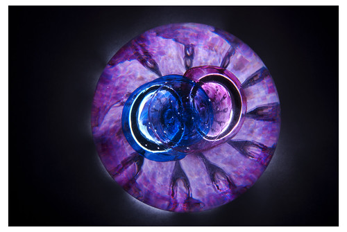
I had to do this a couple of times before I could set the exposure right so that the light did not penetrate too far through the paper and flood the outside of the ornament with light. In the end I was happy with the colours captured as the combination of light and colours within the ornament have come out as cool.
4.Orange and Red - Warm
I had taken this image originally to try and capture complementary colours but it did not work out right. However working with the image I noted that if I cropped it down to less than half of the original frame the image then became a collection of warm hues.
Nikon D50, focal length 220.0mm (35mm equivalent 330mm), aperture f40, speed 1/4 second, ISO 1600, portrait white balance, matrix metering, hand-held camera, No flash
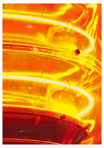
I am pleased with the warm colour produced in this image as in fact it was a bright red lamp and when the image was recomposed through cropping it became warm and a very nice composition.
Colour Contrast
1.Violet and Red
While attempting to capture the complementary colours of a sunset I had noted that the sunset would produce a warm red against the dark blue of a sky. Unfortunately I was unable to capture the image as I had wanted as I just could not obtain the correct hue of blue or red. It was while sitting looking at the sunset outside my windows that I noticed that the sky was beginning to darken and that the sunset was producing red and violet hues within the clouds.
I waited until the sun had moved below the horizon so that the lens was not filled with the yellow light from the sun and then I captured several images of the cloud colours.
Nikon D50, focal length 78.0mm (35mm equivalent 117mm), aperture f4.8, speed 1/60 second, ISO 800, sunlight white balance, matrix metering, hand-held camera, No flash
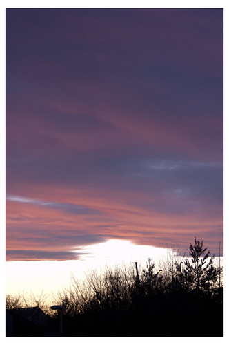
I am very happy with this image as it has a deep red violet hue in the middle of the violet and red which I think produces a warm set of contrasting colours.
2.Orange and Green
When I started to think about colour contrast I looked back at the colour wheel and examined the relationships of the primary and secondary colours and how I could use these relationships to create my colour contrast images.
One of the first ideas for this I had, was for an orange pepper. I noted that the green stalk on some peppers is quite pronounced and that with the correct orientation and composition I could use one for this example
I found that I had to find the right shape of pepper as some had more stalk than pepper and some stalks did not curve in a way that I wanted.
Nikon D80, focal length 105mm (35mm equivalent 157mm), aperture f45, speed 1/125 second, ISO 800, auto white balance, matrix metering, tripod mounted camera, No flash
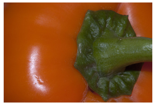
I finally found this pepper and placed it on a high position in direct sunlight. I then focused closely in on the pepper and recomposed slightly until I had the stalk in the position that I wanted. I did not want any of the background to be seen and I wanted the round shape of the base of the stalk to be reflected in the curve of the pepper. I like the simplicity of the image and the colours are just as I wanted them to be.
3.Yellow and Red
I spotted this van parked in the street, and noticed that the logo and the stripes on the van were all red and yellow. I decided that I wanted a low vantage point on the side of the van and that I wanted the straight diagonal lines on the van to be positioned to intersect with the physical lines of the van.
Nikon D50, focal length 102mm (35mm equivalent 153mm), aperture f4.8, speed 1/150 second, ISO 800, auto white balance, matrix metering, hand held camera, No flash
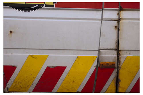
I liked the final composition as the red and yellow lines repeat across the frame and the physical lines of the van run across the frame. These lines intersect with the door lines which are dark and they help break up the frame into sections.
4.Yellow and Red
I walked through this scaffolding and I saw that the yellow lines repeated up the street on either side of the frame and across the top. This was reflected onto the pavement making the grey stone yellow tinted as well. I liked the small stripes of red and white tape on the yellow and I had decided at first to use this as an example of colour accent. When I framed up the composition through the viewfinder I decided that I wanted to use it for colour contrast. As it contained the yellow and the red, but importantly it contained a blue hue in the stone and in the sky and building at the end of the row of yellow scaffolding.
Nikon D80, focal length 62mm (35mm equivalent 93mm), aperture f11, speed 1/160 second, ISO 3200, auto white balance, matrix metering, hand held camera, No flash
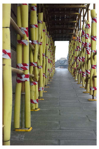
In the end I just like the simplicity of the image, the yellow striping up and across the screen and the blue rectangle at the end of the repetition.
Colour Accent
1.Blue Flag
While passing through a part of Edinburgh I saw that the sky was pale flat and white and against that there was a flagpole. I could see that the flagpole and the sky were almost the same hue of white and that the flag was a single point of colour against the sky.
I composed closely on the flag taking out the top of a building and positioning myself so that there were no buildings in the background and I shot at this angle so that only the only real colour in the frame would be the blue of the flag.
Nikon D50, focal length 240mm (35mm equivalent 360mm), aperture f18, speed 1/200 second, ISO 800, auto white balance, matrix metering, hand held camera, No flash
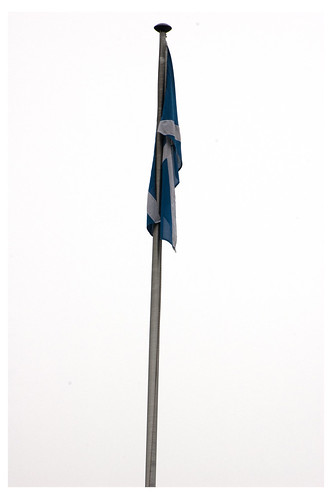
I was pleased with the final outcome as the flagpole itself splits the frame vertically in the middle and the eye is drawn upwards to the limp flag hanging wrapped around the flagpole. I’m also pleased with the simple hue of the blue of the image as it could have been complicated if the sky was a different colour.
2.Red Square
I had spotted this architectural feature within a building a while back and I was just waiting for a time when I could use it. Every time I saw it my eye was drawn to the red box frame. I quickly positioned myself on a walkway facing the area, and framing in closely to avoid the edges and top supports of the strips, I shot a single frame of the feature.
Nikon 50, focal length 300mm (35mm equivalent 450mm), aperture f5.6, speed 1/100 second, ISO 800, auto white balance, matrix metering, hand held camera using wall and beanbag support, No flash
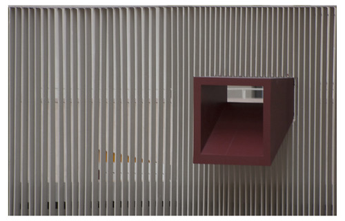
I am pleased with this as, although it is designed to been looked through at from the opposite side to me and my camera, I managed to capture the colour of the box frame within the plain white framing of the vertical supports.
3.Orange spots on green
While I was sitting next to a tree waiting for the right moment of sunrise to shoot another image, I saw that the dew on the very tips of the shoots was beginning to coalesce and was shaping into droplets on the end of every shoot. As the sun rose I could see the yellow light was being reflected in the droplets. Hunching forwards I could see that from my position I had a background of green with these small yellow droplets spotted around. I framed up the composition and took the image quickly before the light dropped or the droplets were disturbed by the wind.
Nikon D80, focal length 122mm (35mm equivalent 183mm), aperture f4.8, speed 1/160 second, ISO 400, auto white balance, matrix metering, hand held camera, No flash
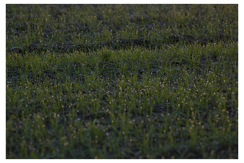
I am very happy with this as it was pure luck to be there at that particular moment in time and to see the accent of yellow against the green. It was just what I was looking for in this part of the assignment.
4.Red pillar box
I had seen a few years ago, that the Innocents Walkway ran through a tunnel underneath a building. When I had gone to see the tunnel at that time it was filled with primary and secondary coloured graffiti in the style of 1980s video arcade games. Remembering the graffiti, I went to see if it was still there, which it was not. It had all been washed off with the moisture that runs down the tunnel walls. While I was there I had the idea of using the curves of light which repeat down the tunnel as points of light for this assignment. However when I shot the image and examined it I was not happy with the final result and dropped the idea entirely. What I did see on my exit from the tunnel, looking back and upwards, was that there was a Victorian pillar box sitting behind the wall above the tunnel. Turning round and moving backwards and forwards I was able to get in a position where just the top of it was visible. I then composed on the pillar box making in just above point of centre within the frame. I wanted the wall to run across the frame and reflect the same dull brown grey colour of the branches behind the pillar box, this was helped by the flat grey light of the day and the dull white sky.
Nikon D50, focal length 240mm (35mm equivalent 360mm), aperture f5.6, speed 1/160 second, ISO 800, auto white balance, matrix metering, hand held camera, No flash
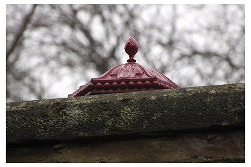
The red is a very dark hue and eye catching and it draws the eye away from the tangle of branches down on the wall and back into the pillar box.
Summary
I have found this assignment a bit of a challenge as the weather conditions were poor and this did not allow me to get outside very much. The light outside has been very dark and flat and I had difficulty finding the right objects that I could use to create compositions. This forced me into a position where I had to delay my assignment work and this was causing a lot of frustration for me as I could not experiment with different colours, subjects or composition techniques.
At the end of the assignment I have however started to re-examine the world around me for the colour relationships and I can now look at previous images and see why some appear to be better composed and eye catching than others. This part of the course has also reinforced the primary and secondary colours and their individual relationships as well as why some colours clash and why some colours are complementary, which is something I had not fully understood. The biggest part for me was relearning the colour wheel as I was used to the reflected light primaries rather than the pigment primaries.
No comments:
Post a Comment