Where: In different locations, in all weather including a gale.
When: Various times, sometime with natural light and at other times utilising whatever light source was available.
How: First of all I had to find the right combinations of complementary colours in the correct ratios. Then for the second part take photographs were the colour relationship in complementary colours did not adhere to the combinations and also to take photographs were there may be more than two colours. Again like the previous exercise I found this exercise quite frustrating as repeatedly I would come up with an idea, which I would photography only to find that combination was not correct or that the colour saturations did not appear as I wanted. Also being restricted by movement and by the weather meant that I lacked the colourful surroundings where I could obtain the correct combinations.
What I first of all learnt that getting the right combinations was quite hard but in the end I was spotting them everywhere, I also started to spot combinations of colours which were not complementary but their clash of colours caught my eye.
As I captured each set of images I uploaded the images from the camera and did a straight conversion of the RAW image into a JPEG without changing any of the settings from the camera.
Complementary colours in their ratios
Red/Green
I expected this shot to come out fairly quickly as I was surrounded by the colour red and I thought that I would easy find the combination of red and green together. In time however I found that many of the ideas that I came up with (fruit and vegetables, cars, doors, signs, LEDS, etc) either did not have the exact hue or the right combination. I took a vast number of shots using differing lenses distances and composition ideas before I finally chose the combination of the red and green perfume bottles. I spotted them in a shot and although I had to replicate the same combination at home I was happy with the photograph
D80,Aperture f/3.8, Shutter Speed 1/60 sec, ISO 1600, 105mm (35mm equivalent 157mm), Pattern Metering Mode, FlashWhite Balance, Tripod Mounted, 105mm lens, on board flash
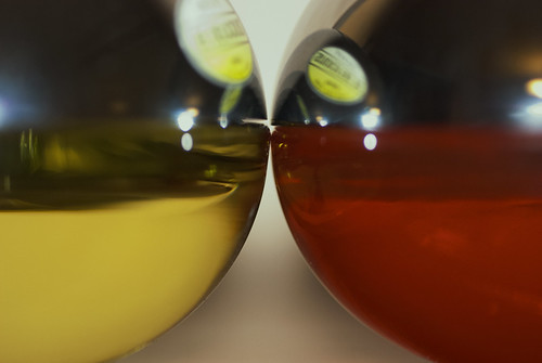
I feel that this exposure has left the correct hues and that the red and green are balanced together in the 1:1 ratio. I was pleased that the two items sat together closely allowing me to zoom right into the objects. I also liked the composition as the eye is drawn in down through the curves and also into the centre from the sides of the frame.
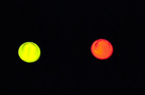
I also liked this second red/green combination that I photographed where I closely focused into a pair of led indicators on a piece of computer network equipment. I have decided to include this as it ran a close second and I liked the contrast between the very dark background and the isolated spots of colour.
D80,Aperture f/5.3 , Shutter Speed 1/200 sec, ISO 1600, 105mm (35mm equivalent 157mm), Pattern Metering Mode, Auto White Balance, Hand held, 105mm lens.
Blue/Orange
I found in my surroundings that I had a lot of blues combined with other colours but not with orange. I photographed a number of sunsets where the sky was blue but the light was a deep red, a washed out yellow/orange or a washed out pink/red none of which was suitable.
It was while I was walking back over some rough ground that I spotted the orange lights reflected in some pools of water, on closer inspection I found that the tide was out in a small bay and this allowed me to walk right up to the edge of the water and while standing quite high look down into the water and capture the long fingers of orange light reflected over the blue water.
D50,Aperture f/4.5 , Shutter Speed 1/60 sec, ISO 1600, 70mm (35mm equivalent 105mm), Pattern Metering Mode, Manual White Balance, Hand Held, 18-70mm lens.
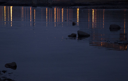
I was very happy with the final image as this allowed for the 2:1 ratio for the colours and I liked the repetitive nature of the waves and the ripples of light as they flow down the frame.
Violet/Yellow
This was one of the hardest to capture as at the dead of winter there were not many violet and yellow flowers about, which is the idea that I had originally. I played around with a few ideas consisting of car lights and reflected colours but the ideas just did not pan out and I was not happy with the results. It was while watching a colleague talk that I noticed that he had a number of brightly coloured balls and I managed to persuade him to set up a couple so that I could take a few shots. I am not entirely happy with the final image but I was aware that the lens that I was using was extremely slow to focus and that the lighting was very poor so that I had use the lens at a very open aperture to capture all the available light.
D80,Aperture f/3.5, Shutter Speed 1/10 sec, ISO 1000, 105mm (35mm equivalent 157mm), Centre Weight Metering Mode, Auto White Balance, Hand Held supported on a bean bag, 105mm macro lens.
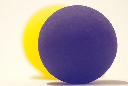
I was surprised to see that although the yellow ball was further back and in a smaller ratio it still appeared to be quite large and to my eyes it makes the yellow ball appear to be larger in size than the violet ball.
I found this part of the exercise quite hard as some of the colour combinations and ratios were quite hard to find and some were almost impossible to capture at this time of the year
Complementary Colours not in their ratios or combinations
This part of the exercise was much more enjoyable, mainly because that I had found that I was spotting colour combinations a lot easier and that it was less restrictive and this allowed me a freer licence to use the combinations that appealed to me.
Green/Yellow
One of the colour combinations that I see a lot of and which appeals to me is the combination of yellow and green commonly seen here in the gorse bush. I liked the fact that the green is almost a background colour and the yellow is bright and almost separate from the rest of the bush. Even late in the day the yellow attracts my eye and the green which dominates the bush is pushed into the background.
D80,Aperture f/1.8 , Shutter Speed 1/100 sec, ISO 1000, 50mm (35mm equivalent 75mm), Matrix Metering Mode, Auto White Balance, Hand Held, 50mm lens.
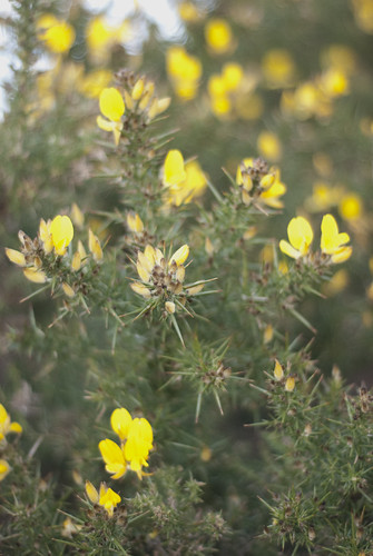
There is something about the yellow in the image that makes me happy and although it is a brighter and more intense colour that the green of the image, the imbalance where the yellow dominates the image although it is of a smaller ratio to the green. I feel that this imbalance works for the yellow and against the green.
Blue/Yellow
I spotted this image out the corner of my eye and I played with a few different compositions and framing before deciding on this one. I liked the reflection of the yellow on the blue and the intenseness of the blue against the yellow. The blue to yellow ratio is about 2:1 and I feel that this works for the blue as it makes it dominate the image and it drives the yellow back into the frame. The eye is drawn to the blue and to the reflections and away from the yellow.
D50,Aperture f/4.5, Shutter Speed 1/5 sec, ISO 1600, 50mm (35mm equivalent 75mm), Matrix Metering Mode, Auto White Balance, Hand Held, 50mm lens.

Looking at the image, there is almost a red tint to the image that was not there when I took the picture, I think that it may have come from the greyish wall which was behind the yellow grit bucket and must have been reflected in the car.
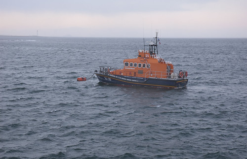
Blue/Orange
I like the fact that the blues in their varying hues outnumber the orange, but because the orange is so bright and isolated against the blue it allows the orange to standout within the frame. If you take away the blue grey of the sea and the white blue of the sky then the orange ration is higher than the blue of the boats hull.
I liked the repetitive movement of the waves and the fact that the orange bridge on the boat is high in the frame and slightly off centre. Certainly studying the image as a small thumbnail the orange is more eye-catching that the blues.
D50,Aperture f/6.3, Shutter Speed 1/30 sec, ISO 1600, 44mm (35mm equivalent 66mm), Matrix Metering Mode, Auto White Balance, Hand Held (in a gale) , 18-70mm lens.
Red/Green
I had seen this unusual coloured sign earlier on in the day and I went back to photograph it as the ratios of the image are almost but not quite 1:1. I feel that the imbalance in the rations makes the red less intense and allows the green to dominate within the frame.
It was an unusual choice to paint a sign in such a pair of complimentary colours as I would have through that they wanted the sign to stand out more rather than to be as “normal” as this.
D50,Aperture f/4.5, Shutter Speed 1/40 sec, ISO 1600, 55mm (35mm equivalent 82mm), Matrix Metering Mode, Auto White Balance, Hand Held, 18-70mm lens.
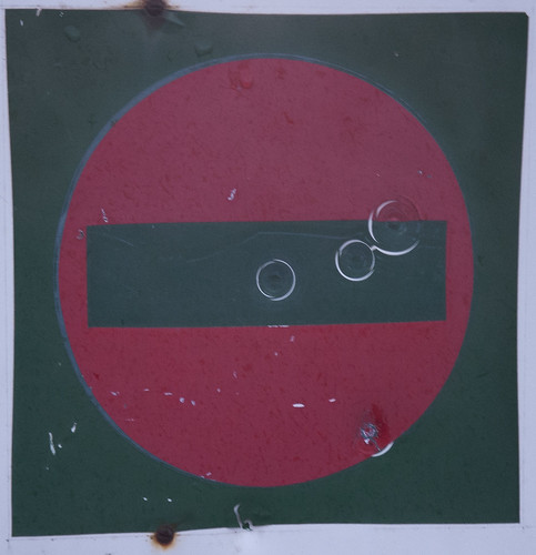
Looking at this I feel that the red is lost amongst the green.
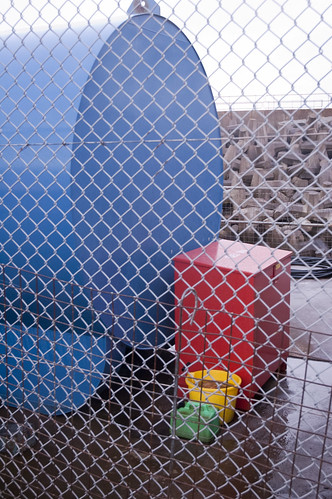
Blue/red/Yellow/Green
I was very happy to see this combination of colours in this ratio as it somehow allows the colours to flow down in size and intensity to the point where the green is almost not seen even though it is almost the same size and ratio as the yellow.
The blue dominates the frame, but I feel that my eye is drawn away from it to the red where my eye then slides down to the yellow and the green. I feel that the red because of its’ intensity is the main focal point of the image and the ratio of 4:2:1:1 somehow works against the blue.
D50,Aperture f/4.5, Shutter Speed 1/25 sec, ISO 1600, 29mm (35mm equivalent 43mm), Matrix Metering Mode, Auto White Balance, Hand Held, 18-70mm lens.
I found this exercise quite frustrating at the start but after a while I did find that I was beginning to examine my surroundings constantly for combinations of colours and seeing whether they were complimentary colours or not. I am beginning to understand why some images appeal to me while others do not, and the use of colours to create certain effects within a frame and composition.
No comments:
Post a Comment